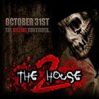
Released on Halloween a year after the first, The House II is a direct sequel to The House. Also similar to the first one, it was released in a multitude of different versions over the years. To start off this review, I'm going to list all the iterations below.
There are two 2006 versions. Both came out on Halloween.
- There is the slim case version that came with specific art that I will post below
- There is also the free downloadable version, with very slightly altered art
- The 2008 machine press, which came with different art and a jewel case
Finally, the 2009 reissue of the album on Lo Key's record label, Lokerecords. It comes with different, finalized art that I will be posting below
With that I will move on to other aspects of the EP.
Graphics:
To clarify, I only have the 2009 reissued press of the EP. I will only be speaking on this press.
The cover art consists of a hand with the thumb, pinkie, and ring finger severed. This leaves only the index and middle, simulating the number two. It's set against a crimson background. Unique, stark, well-done.
On the back you have you track listing for the five tracks, and a Lo Key logo above it. The cover art is a slip, yet again, and on the back of the slip is an advert for Infectshop.com. On the CD is the cover art, but printed and fit to the disc. Nothing in the CD rest.
Content:
There's not too much I can say about this EP. And even if there was, I don't think I'd want to talk much about this EP. I'll keep it honest, short and sweet for my ninjas.
Similar to the first EP, it was released on Halloween, and it was well-received within the realm of the underground. The aesthetic formula hasn't changed; if you glance at the tracklist, you'll see a familiar list of household items and devices meant to illustrate the story of a home. This is, again, a very creative and fresh concept for production, and is something that hasn't quite been done by other artists.
The similarities don't end there, which is unfortunate for this EP. The House II suffers from many of the same ailments that plagued the first entry in The House series. The first thing here that doesn't shine is the five-song tracklist, which wouldn't be a problem if the CD was cheaper, or easily available for free download. While the concept of this EP is fresh, five songs to paint the whole scene just isn't enough, and the extended play's content feels seriously crammed as a result.
The biggest folly of the first EP was that the content was too much of the same, "Murda Murda Murda!" bullshit, with no variety in the themes of the EP whatsoever. There is some of that this time around too, but even more noticeable is that the content seems scattered and tends to jump around quite a bit. Instead of a barrage of the same shit over and over, Lo Key opts to instead jump all over the place with a wider berth of messages. This does the CD some justice and is much preferable to the monotony of the first EP, but it makes the CD feel crammed because of the tragically short tracklist. Even one or two more songs would have helped to make this CD feel less congested.
While this CD is definitely a step up from the first entry in the series, there is so much that still needs to be improved on. This entry is very far from being perfect, so here's hoping that Lo Key really steps it the fuck up on the next entry because let's be real, it needs to happen.
Ninjas I've said it once, and I'll say it again: This might be worth your money, it might not be, but what's more important to remember this time around, is that this CD probably isn't worth your money, and you're better off not wasting your time with this EP. Yes, The House is important to Lo Key's career, but there isn't enough good content on the CD to justify spending your money on it. Go listen to it on YouTube or something.
JRH gives "The House II" by Lo Key a: 1.4/5!
("Nah, not really")
Strong points:
- Not everything about this CD is bad. Some big hits in Lo Key's career are here, specifically, The Needle and The Child. Unfortunately, they outshine the rest of the EP and make everything else look like shit in comparison.
- The art for the CD is much better than the art for the first entry, but isn't exactly spectacular either
Weak points (2many2count):
- Lo Key tries to do way too much with way too little, and ends up making the EP sound crammed because of it. Even one or two more tracks would have really helped make this EP sound less congested.
- Really, there are only two good songs on this album, and they've been pressed onto many other CDs for your listening pleasure. Look into those if you want a nice CD to slam for a while.
>12.99 for a five-song EP
That's it ninjas. Now it's time for the graphics:
 |
| Slim-case, 2006 |
 |
| Slightly different than the one above; different color tones. Free download, 2006 |
 |
| Machine press, 2008 |
 |
| Finalized art, 2009 repressing on Lokerecords |
No comments:
Post a Comment